Want to have the data curves "float" relative to each other?
This example is from our Interference Lab - but the settings in Steps A-E are the ones that let the data "float".
The simplest way to do this is just create a new graph (that way we can start from a known condition, though we have to make some settings changes on the graph). Here are the steps:
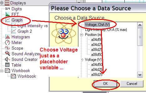
a) Double-click on the GRAPH item in Displays and choose (as a dummy variable) the VOLTAGE, ChA.
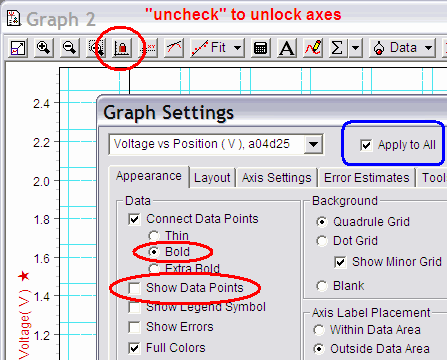
b) Uncheck the "lock axes" button on the tool bar and on the APPEARANCE tab, make sure "apply to all" is checked ... CHECK "Bold" and UNCHECK "Show Data Points" (second screenshot)
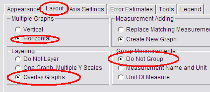
c) click on the LAYOUT tab and click Horizontal and Overlay Graphs and DO NOT GROUP. (third screenshot)
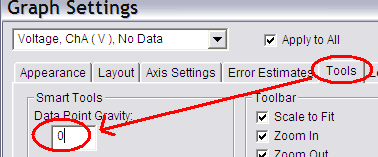
d) click on the TOOLS tab and set the "Data Point Gravity" to zero (this lets us make more accurate measurements on the graph. (fourth screenshot)
e) finally - click OK - the graph is now ready to pull over data from the Voltage data set (we would prefer to have the Intensity - but since we only care about "shape" - the voltage is proportional to the intesity, thus it will work) - but, we have to be careful HOW we connect the data to this graph!
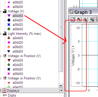
f) Click on one of the DATA items (say, a04d50) and drag it over to the graph, but let it go when it is over the word "Voltage" - you want to make sure the dotted rectangle only exists around that vertical scale and the name of the axis (not the whole graph). This will put a Voltage vs Time curve .. we want vs position ....
g) Repeat with the POSITION item (same one .. say a04d50) - drag it to the new "Time" axis - letting go when your mouse is hovering over the word "Time" - and you only have the dotted lines around the horizontal scale as shown.
At this point - you should have one set of data ... and in this case, since we have 3 other sets of data, all of them should now be in the DATA dropdown box at the top of the graph .. as you select another data run in the DATA dropdown box, you should see the curve light up in the graph ... and you can drag the axes around vertically and horizontally as needed.
