How do I adjust graph scales?
AutoScaling - you often want to just automatically rescale
what you have on the screen - click on the first button at the top of
the graphs as shown.
Rescale X axis - If you take the mouse cursor and "hover"
over one of the NUMBERS on the X axis, the cursor will change to a
double-arrow with a squiggly line between (yes, squiggly is the
technical term). If you click down and drag to the left or to the
right (stand up, sit down, fight, fight, fight!) - you can expand or
contract the scale as needed.
Rescale Y axis - Use the same technique for the Y axis!
Move the graph itself (that is, move the origin)- If you
want to slide the graph itself around (move the origin), then move the
cursor over one of the axis lines themselves, the cursor should change
to a hand shape - now you can click down and drag the graph around
(basically, the two axis scales are frozen and you are moving the
origin).
Autoscaling : 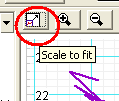
X scale : 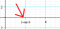
Y scale: 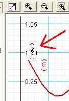
Move Graph itself : 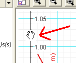
Can I change the thickness of the lines on the graphs?
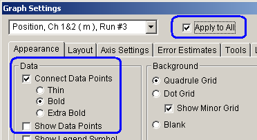
Right click in the graph and select SETTINGS from the popup list.
You can change the appearance from the Appearance tab. The suggested values would be Connect the Datapoints with BOLD lines (but to NOT show the Data points). If you need to change it some other way, feel free.
But, notice the check mark next to Apply to All (that "all"
refers to the RUNS on that particular graph). This also means that
future runs will look the way you set (if you don't check that, then
only the specific run listed will be set that way, and no future
ones).

Can I change the COLOR of the lines on the graphs?
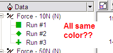
Sometimes DataStudio "hiccups" and starts coloring all the
runs the same color. That's useful?! Since we don't show the "markers"
on our lines, we just lost our ability to distinguish two curves
easily.
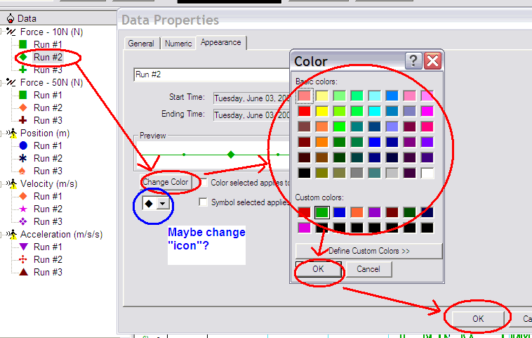
So, double-click on one of the runs in the DATA list on the left - click on the APPEARANCE tab if it is not visible, and click on CHANGE COLOR - this lets you pick the color you want ... and then click OK, etc. to get back out again.
Rinse, and repeat.
